A fresh look for the Sonics.
PRESS
Local team scores new design via Rhythm.
You can’t say that Rhythm isn’t for the children.
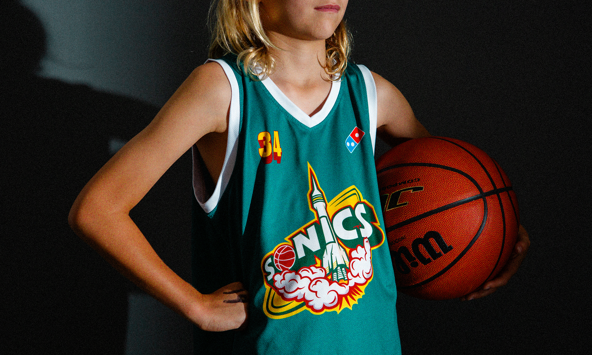
When local under-10 boys basketball squad, the Sonics, needed an assist with a sick new jersey graphic, we answered the call.
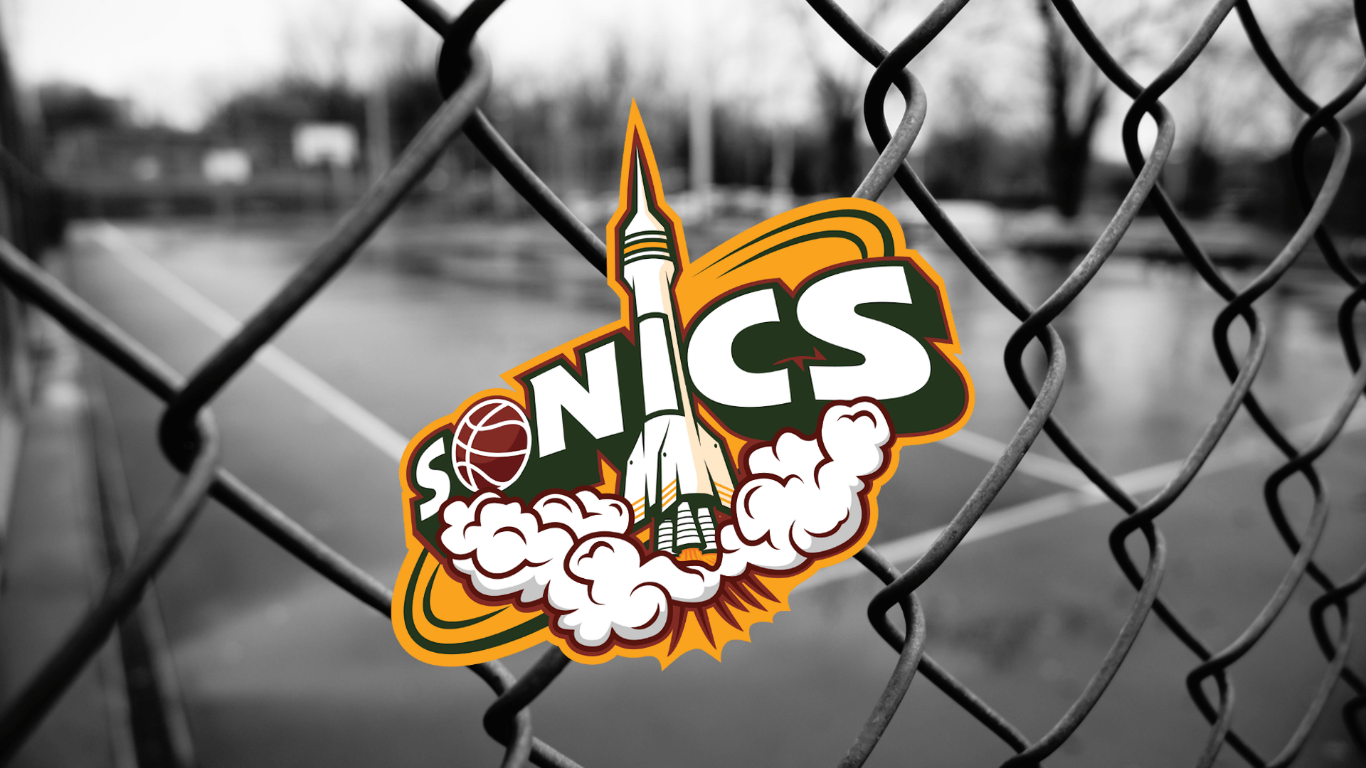
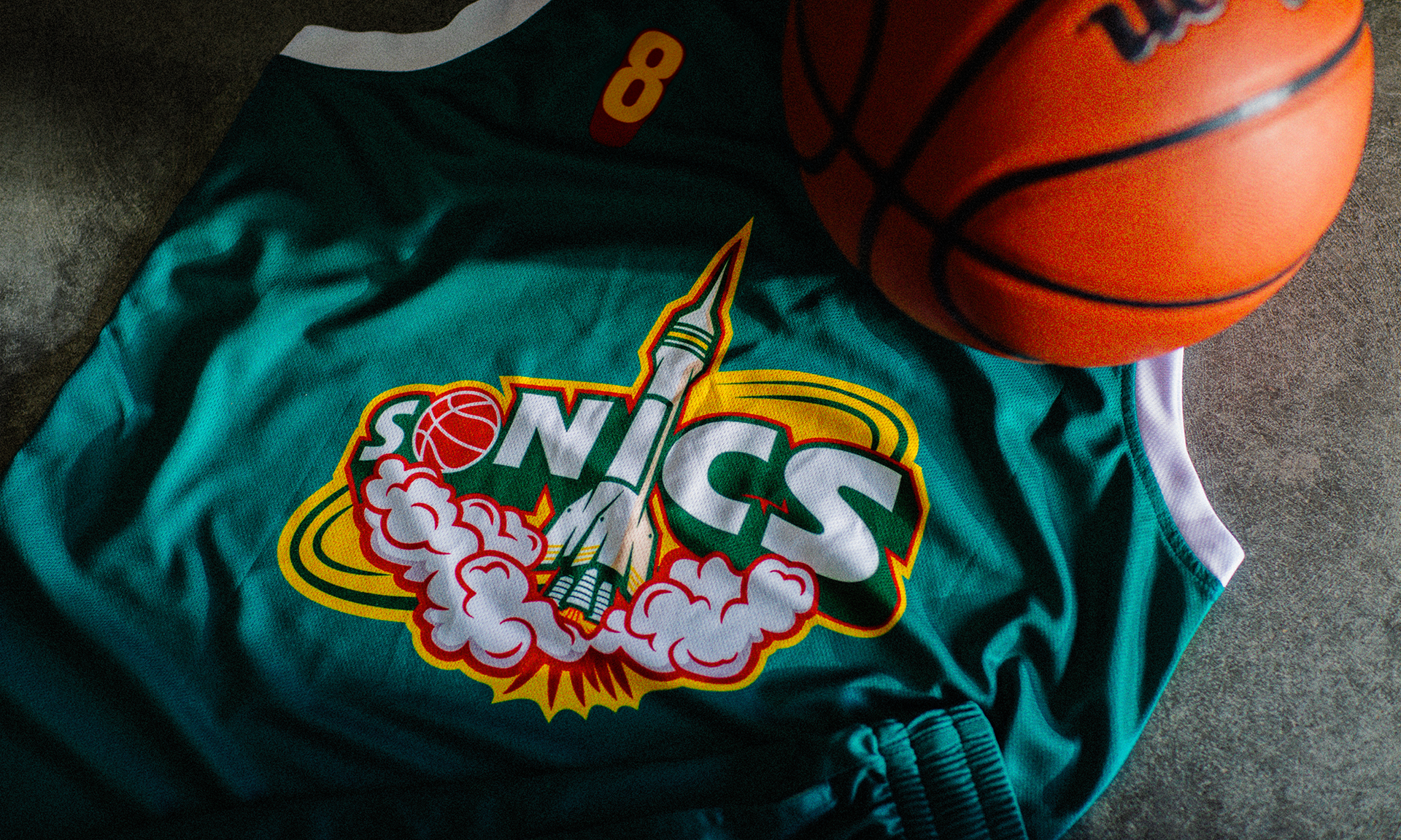
The brief was straightforward - create a new look for the team based on the name. Referencing NBA franchise the 'Seattle Supersonics’ classic look from the 90s, the Rhythm design team set to work.
Graphic designer @enzodelyferdesigns illustrated a rocket that integrates seamlessly with the 3D-look typography. The thrusters and smoke give a sense of pent-up power, ready to explode upwards, just like a basketball player at the bucket. The green, teal, red and gold colourway is unusual for local leagues, so without a doubt the Sonics stand out on the court.
Needless to say, the boys were stoked with their new look. Taking to the court with a custom strip gives the team a swagger that can mean the difference between a win and a loss.
